Humans are highly visual beings, and as such, they can easily be swayed by an image or a video. So, unsurprisingly, choosing the wrong visuals for your WordPress landing page can lead to an increased bounce rate, while choosing the right one can boost engagement and conversion rates.
Let's take a look at five different ways to choose the best possible visuals for your landing pages, along with some illustrative examples to set you on the right track.
Migrate to uPress within 24 hours
The main purpose of your landing page visuals is to showcase what your brand is about. No matter how well you construct your copy, the images you choose will always speak a little bit louder and convey more meaning.
For starters, try to find words that describe your brand best. Is it sophisticated, edgy, traditional, relaxed, hip? Once you are satisfied with your choice, you can judge each visual element by this merit. Does it match your brand's tone and voice well enough?
Take a look at the solution Spores has come up with. As their actual product is difficult to define, they have chosen a custom image that speaks volumes about the brand: cutting-edge, futuristic, tech-based, and innovative.

Source: spores.app
None of these words appear anywhere on the page, though. You're aware of them based on that single landing page image.
To make your visuals more dynamic and more engaging, you can literally make them move. Animated images, like gifs, are a great way to draw the eye in and add more interest to any page.
You'll have to be careful, however, and make your animated visual WordPress-appropriate. Compress it to make it as light as possible and make sure your servers can handle the load.
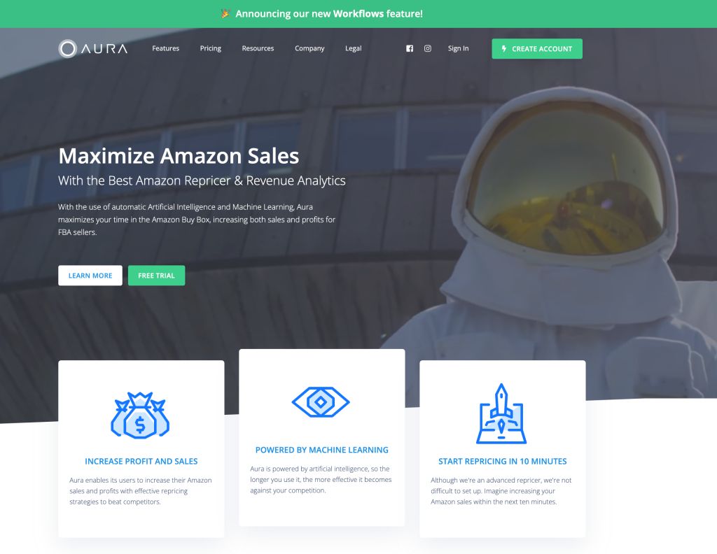
Naturally, the animation should also be on-brand and illustrate a specific point on the page. Let's take a look at how Aura has chosen their moving image.
Source: goaura.com
They feature an astronaut, which, at first glance, may have nothing to do with Amazon sales. However, the allusion is easy to spot: take your sales to the Moon and beyond with Aura's solutions.
Visuals are also a great way to help your visitors digest complex or long-winded streams of data. If your landing page would benefit from data visualization, you can use an infographic to help your visitors get a better hang of whatever it is you're trying to convey.
Other than ensuring that the information you're displaying is correct and up-to-date, the infographic itself should, once again, load fast. It should also incorporate some of your brand's colors and use a font that's aligned with your message and voice.
You can use a free tool like Canva to create this infographic – it doesn't have to be anything spectacular. Its main purpose is to make information easily digestible and more visually appealing.
Reckenen has done some great infographics over the years, and this one on the impact of fraud on small businesses is a great one to try to emulate. It's short but conveys a lot of information, and the brand's overarching design theme has been implemented excellently.
Another way to choose your landing page images is to think about the color story.
The method to employ is along the lines of “keep them on brand.” Start by landing on the kinds of emotions you want to evoke with your visuals, and go from there.
You'll already have noticed that most eco-friendly brands choose to use a green color palette. A lot of SaaS companies use blue, as it's supposed to suggest trustworthiness and knowledge. Purple is often considered a color that fun brands use, and so on.
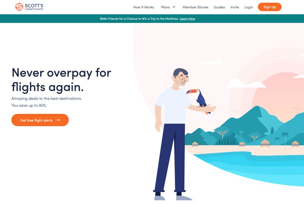
You can also mix your colors and use a combination to achieve your desired effect. For instance, Scott's Cheap Flights has used turquoise and pink to evoke that sense of paradise we all wish to embrace on our holidays.
Source: scottscheapflights.com
Their illustration is rather simple but very on-brand and in line with their key messaging.
Finally, you can choose visuals that feature real people. This choice is best when you want to establish a deeper connection with your visitors and make them feel part of a group.
Human faces can also show a lot of emotion that will be easy to relate to. So, for example, you might choose to use stressed and anxious faces to illustrate a pain point, and smiling and relaxed faces to showcase your solutions.
Bear in mind that it's always best to reach for images of people who make up your target audience. For example, if you are marketing to an older audience, don't use young couples on your landing pages, and vice versa.
Furthermore, you can use the photos of your actual customers and clients. User-generated content is an effective way to both add a layer of social proof and showcase your products or services.
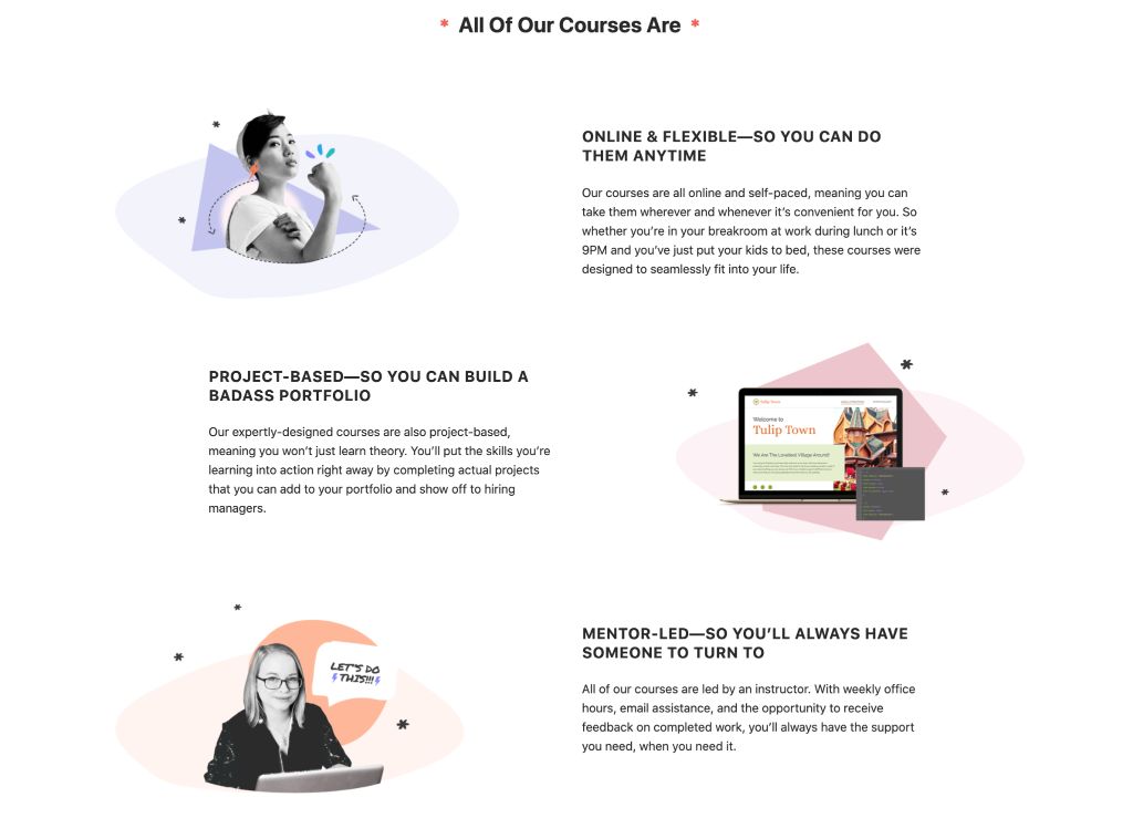
Skillcrush has used illustrative images of real people on their landing page to make themselves more relatable and approachable.
Source: skillcrush.com
It's much easier to identify with a young woman learning to code than an abstract illustration of the computer language.
Using visuals on your WordPress landing pages can make them much more effective and much more appealing to any target audience. The key is to consider what the best choice would be and how to ensure that it is on-brand.
